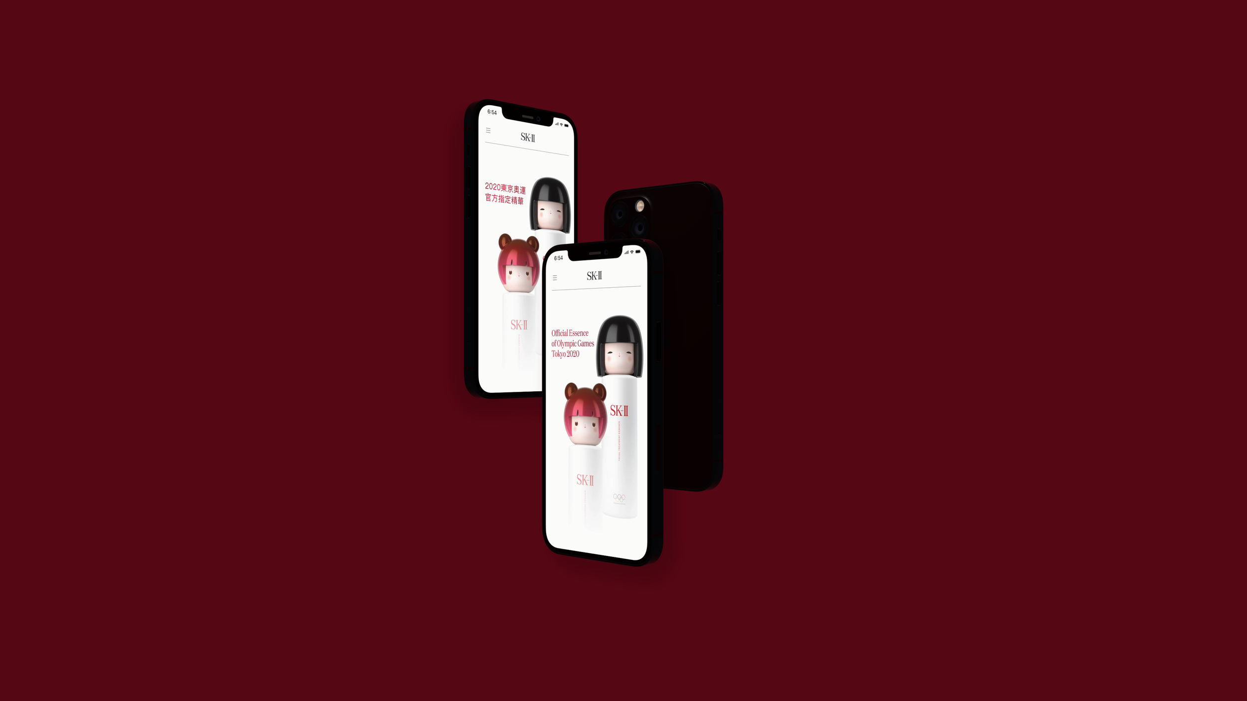
sk-ii x olympic games tokyo
Led the art direction & design of SK-II’s Olympic campaign e-commerce experience, driving product engagement across four key global markets
ꜜ
Art Direction ﹒ Visual Design ﹒ UI/UX Design
SK-II x Olympic Games Tokyo
As an official partner of the Olympic Games Tokyo, SK-II launched limited edition designs of their products, including two limited-edition bottles of the brand's signature Facial Treatment Essence: Tokyo Dolls, which consists of a pair of cartoon caps, inspired by kokeshi dolls (traditional Japanese wooden dolls), First Experience Kit Limited Edition as well as Special Edition collectible pins.
Client
Procter & Gamble ﹒ SK-II ﹒ US, Japan, Taiwan
ROLE
Art Director ﹒ Visual Designer
TEAM
HUGE Singapore (Agency)
Jasmie Ezran (Visual Designer) ﹒ Lynne Hong (Copywriter)
Joyce Lee (Motion Graphic Designer) ﹒ Bobby Tay (Creative Director)
SKILLS
User Interface / User Experience Design ﹒ Visual Design ﹒ Web Design ﹒ Art Direction ﹒ Conceptualisation ﹒ Wireframing
PLATFORM
Web (Mobile ﹒ Desktop) ﹒ E-commerce (Tmall ﹒ Rakuten)
Tools
Sketch ﹒ Invision ﹒ Adobe CC ﹒ Photoshop ﹒ Illustrator ﹒ Keynote
The Task
We were tasked to design the eFMOT (e-commerce first moment of truth) to showcase the SK-II x Olympic Games Tokyo limited edition products for the US, Japan, Taiwan & China markets.
Our Objective
Our goal was to entice customers in the US, Japan, Taiwan & China to buy SK-II’s products during the promotional campaign period leading up to Olympic Games Tokyo including the Facial Treatment Essence Limited Edition: Tokyo Dolls, First Experience Kit Limited Edition & promote the GWP (gift-with-purchase) Special Edition Collectible Pins.
Our Approach
As eFMOT plays a vital role in the customer journey, we leveraged the data of customer behaviour from each market (US, Japan & Taiwan) to showcase the products in a strategic manner, with a nuanced narrative for each platform & market. We planned & mapped out the content design for each platform & market based on the data of customers’ browsing & shopping behaviour, preferred platforms, the popularity of specific products in each market as well as features & technical limitations of each platform.
SK-II.com
US (English)﹒ Japan (Japanese) ﹒ Taiwan (Chinese)
Rakuten
Japan (Japanese)
Tmall
China (Chinese)
With the initial overall flow for the different markets & platforms, we proceeded to conceptualise, storyboard & design the key screens for each market & platform. As we designed, we moved around & removed non-essential content to ensure it was digestible & would not overwhelm our customers. This was a collaborative & iterative process with the brand & innovation team at SK-II.
Art Direction & Visual Design
We brought the Tokyo Dolls to life through the animation of their facial expressions & dynamic composition of the bottles, as well as incorporated visual elements inspired by Japanese manga into the layout, while maintaining the integrity of the SK-II brand.
SK-II.com
US (English)﹒ Japan (Japanese) ﹒ Taiwan (Chinese)
Bestsellers
PDP
Hero KV Video
Rakuten
Japan (Japanese)
Storefront
PDP
Tmall
China (Chinese)
Storefront
PDP
My Role
As the Art Director, my role was to lead the art direction of this project to ensure a cohesive visual language that adheres to SK-II’s brand identity was applied across all touchpoints. I worked together with the copywriter & creative director on the content design & information architecture & the junior designer on the visual & user interface design. I conceptualised & storyboarded the key videos & oversaw the motion graphic design work done by the motion designer. I also ensured a seamless handover of the design & assets to the production & development team.
Key Learnings
Due to the tight timeline, minimal user research & user testing were conducted. Instead, we worked with the SK-II team to gather existing & previous data on customer behaviour from each market. Hence, I would have hoped to conduct user interviews, research & testing to gather current insights.
Also due to the tight timeline, we had minimal involvement in the development process, after handing over the designs for Rakuten & Tmall. Instead, we only focused on the end-to-end process of SK-II.com. Hence, I would have hoped to be more involved in the production & development process across all the platforms.
Working with technical limitations was a challenge for us as well. We had to make some design compromises such as using only static visuals for Rakuten & Tmall & alternative fonts for Rakuten due to platform restrictions. However, this has pushed us to think of alternative ways to ensure the overall look & feel of the project look cohesive through the use of visual elements such as shapes & colours.