ocbc
Elevated OCBC Premier Banking’s wealth platform by designing a seamless, end-to-end Unit Trust trading experience across mobile & desktop
ꜜ
PRODUCT DESIGN ﹒ UI/UX DESIGN
OCBC Digital Banking
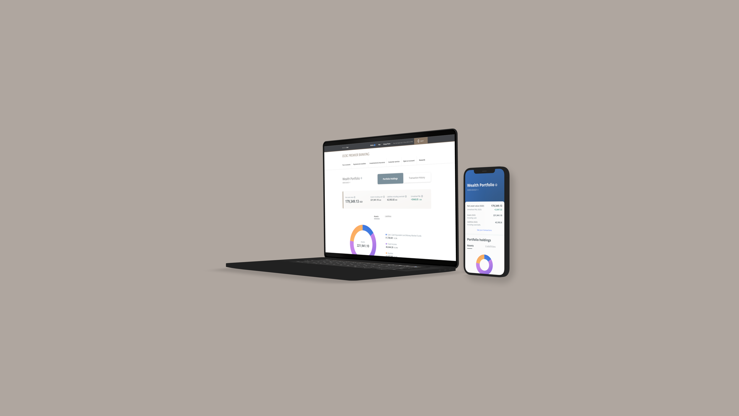
OCBC was launching a new feature on OCBC Premier Banking (Group Wealth Platform), a service for their affluent customers, that would allow customers to buy & sell Unit Trust on their Digital Banking products on mobile & desktop.
Client
OCBC Bank ﹒ Singapore
ROLE
User Interface Designer
TEAM
Section (Agency)
Angela Cheong (UX Designer) ﹒ Theresa (Copywriter)
SKILLS
Product Design ﹒ User Interface / User Experience Design ﹒ Visual Design ﹒ Design Systems ﹒Wireframing ﹒ Customer Journey Mapping
PLATFORM
Mobile App (iOS ﹒ Android) ﹒ Web (Desktop)
Tools
Figma ﹒ Figjam ﹒ Sketch ﹒ Invision ﹒ Miro ﹒ Adobe CC ﹒ Photoshop ﹒ Illustrator ﹒ Google Slides
The Task
We were tasked to design the end-to-end flow for customers to buy & sell Unit Trust on their OCBC’s Digital Banking products on mobile & desktop.
Our Objective
Our goal is to design & implement a feature where customers can buy & sell Unit Trust seamlessly on both mobile & desktop.
Customer Journey
Based on the requirements & leveraging the data & insights from the Customer Experience team in OCBC, we identified key personas of OCBC Premier Banking customers & mapped out a user journey where customers can buy & sell Unit Trust seamlessly on both mobile & desktop.
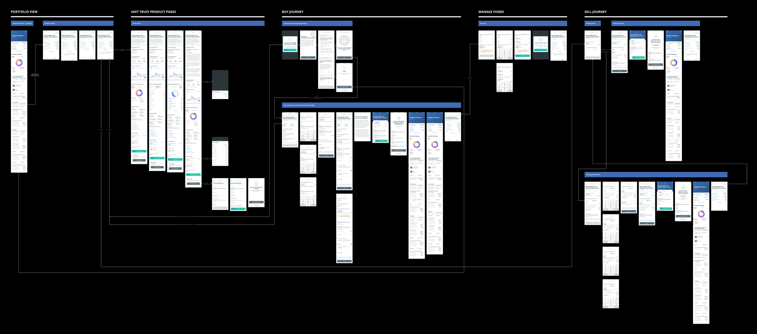
We mapped out the happy flow based on the user journey, explored permutations of the end-to-end flow & identified the MVP, main screens as well as edge cases.
Wireframing & Visual Design
We started designing for mobile first & created high-fidelity wireframes & prototype using OCBC’s brand guidelines & design system as a guide. As we further refined the UI design of the screens for mobile through rounds of discussions with the CX (customer experience) team in OCBC, approvals from various stakeholders within OCBC & UAT (user acceptance testing), we then designed for desktop based on the same flow, permutations, edge cases & feedback.
Overview for Mobile
KEY SCREENS FOR DESKTOP & MOBILE
Wealth Portfolio Page
Buy Unit Trust Page
Purchase Confirmation Page
Design System Library
The design considerations for this project played a crucial role as we put together a Design System Library that encompasses the styling & components across OCBC’s Digital Banking products.
I collaborated & coordinated with other designers working on different streams across OCBC’s Digital Banking products including Wealth View, Precious Metals (PM) & Blue Chip Investment Plan (BCIP) to align & ensure consistency in the colours, styling & usage of typography & components across all streams. We also ensured any gaps, inconsistencies or overlaps were addressed.
Upon alignment, we built the Design System Library for desktop based on the principles of atomic design, by closely referencing the Design System Library for mobile. Each of us contributed to the Design System Library by taking on different sections of it.
My Role
As the UI Designer on this project, my role was to map the customer journey together with the UX Designer & copywriter, design the user interface of the screens while maintaining the integrity of the existing design of the OCBC Digital Banking products as well as the overall branding of OCBC, hand over the design to development team & conduct UAT to ensure the design & features work as they should. The end-to-end process consists of customer journey mapping, wireframing, design, prototyping, development, user testing of the end-to-end flow, implementation of the feature & putting together the Design System Library for desktop.
Key Learnings
In the beginning, taking on this project was a challenge for me as I was not financially savvy & had minimal knowledge about the finance world. However, working on this project had allowed me to have a better understanding, learn more in-depth & broadened my perspectives about finance, investments, financial jargon & terms as well as processes & best practices when it comes to working in fintech.
This was also my first experience working on a Design System Library of this scale, which required multiple teams of designers to come together & align all the designs that we were working on & contribute to the Design System Library concurrently.
One of the challenges we had, in the beginning, was that the designers had minimal visibility of the designs that other designers were working on for other streams. Hence, we came up with a system with the use of collaborative tools such as Miro, Figma & Figjam & open communication to ensure everyone in the team has visibility of the designs, updates, colours, styling or components used across all streams of work.
This was really helpful when we were building the Design System Library as having one point of reference for the designs across all streams of work reduces confusion, gaps & overlaps. I also learnt the importance of delegating tasks in a systematic manner to ensure everyone on the team contributes to the Design System Library effectively.